
NoisyVision was born on January 1st 2011 as a blog, with the domain www.noisyvision.com.
It was initially a personal blog of Dario Sorgato, founder of the association, who in that year decided to write his thoughts, emotions , linked to the feelings of Usher Syndrome, which until then kept almost hidden.
The graphics of the logo and of the first posts were based on the principles of Lo-Fi (Low Fidelity) a type of music production in which the elements generally considered imperfections of a recording or a concert are audible, sometimes as an aesthetic choice.
In this sense, the graphics were very rudimentary, made up of simple figures and lines, like that of the first personal computers.
A way to recall the poor quality of sight of those with Usher Syndrome.
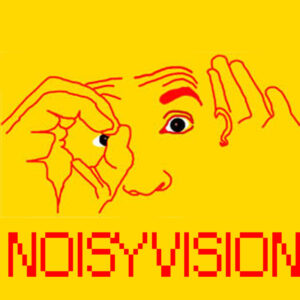
Here is the first logo, which represents a person with an open hand behind the ear to simulate hearing loss and a hand closed in a tube in front of one eye, to simulate the tunnel vision of retinitis pigmentosa.


A logo between noise and vision, as the word NoisyVision itself suggests.
The choice of the name NoisyVision stems from the idea of creating a term related to sound with one related to vision, combining adjectives, nouns and synonyms.
The selection process was long, thoughtful, but also fun. Lots of fun.
Eventually we got to NoisyVision.
Simple, synaesthetic, international.
It contains the word vision rather than sight. Precisely because vision is possible even without sight.
As Helen Keller says,
The worst thing about not having sight is not having vision
It is not a word that in any way refers to disability or diseases.
And this was a spontaneous aspect.
Finally, there is a particularity that makes NoisyVision extraordinary.
It’s palindrome!
In 2016 we decided to convert the domain to www.noisyvision.org to identify in it that it is an organization and not a commercial activity.
On that occasion we rethought the graphics, with the help of the BRRRANDS design studio.
To create the new logo the indications were: SIMPLE, VISIBLE, ATTRACTIVE.
The starting point of the brainstorming was the symbol of low vision.
An eye crossed out diagonally with a hatch that fills one of the two halves of the eye.
In fact, in the final logo of NoisyVIsion, this starting point is recognized.
The diagonal bar then also became one of the V barlines and the N diagonal bar line.
In fact, these two letters can be recognized in the logo.
The letter V and the letter N coincide, as in the N there is also a V (by removing the first vertical bar). The first bar of the N is suggested by an interrupted sign in the lower left corner.
To describe it in words it all seems very complex, while the logo is really very simple, linear, clean, clear, visible.
It is black on a yellow background, precisely to satisfy the principles of high visibility, but also because this color combination transfers our values.
Yellow: Attracts attention, Joy, happiness and excitement, warm and cheerful, positive
Black: Formality and elegance, sophistication and minimalism, authority and power
The Color Psychology Behind Using Black & Yellow In Branding
NoisyVision, if written in lowercas letters, must be written all attached, with capital N and V.
In the logo, it appears as a single word in capital letters or as two separate words, depending on whether the logo is horizontal or square.
We come now to the payoff.
The term pay off or payoff means a short sentence positioned under the logo that represents the company / association, which makes its identity explicit, making the brand recognizable in any circumstance.
The payoff has the role of summarizing the corporate values and leaving a promise to the public. Making it attractive, interesting, recognizable. For this reason, writing a payoff or claim, together with the naming and the headline, is one of the most complex tasks for a copywriter.
A couple of examples of famous payoffs.
Apple, Think Different.
Nike, Just do it.
Vodafone, life is now.
And ours?
NoisyVision, we dont’ see the problem.
Simply fantastic.
A payoff that contains the fact we don’t see, the blindness, but at the same time transforms it in an instant into something positive.
Here’s what’s in NoisyVision.
That’s why it’s a winning logo.
And perhaps also thanks to these more or less explicit messages, we are recognized and recognizable in the world of sensory disabilities and social inclusion.
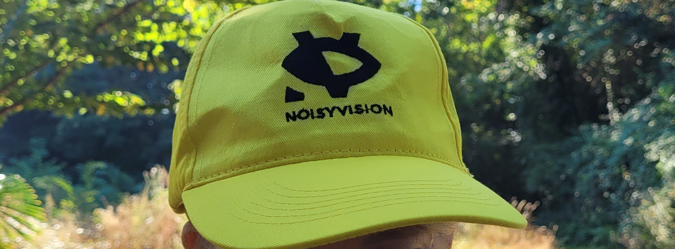
With a logo that can also be worn on a T-shirt or hat.
Because it is cool, isn’t it?